
Branding & Identity
Brand identity that still looks like one company six months later
Logo, palette, typography and the brand kit that holds them together — every lockup, every finish, every size, ready for anyone to use.

We are proud to work with these companies





Fit
Who this is for.
You have one logo file, in one format, and nobody is sure which version is current.
Every quote, invoice and post looks like it came from a different company.
A printer has asked for vector or CMYK, and the answer was a screenshot.
Scope
What arrives.
The mark, and its system
- Logo in every lockup — horizontal, stacked, compact and mark-only
- Each in colour, all-black, all-white and single-colour, as master vectors
- Clear space and minimum sizes, so it survives being placed by anyone
- Palette in hex, RGB, CMYK and Pantone, each colour with its stated job
- Typeface and weights, with the tracking that makes it look like yours
Packs, scoped to the brand
- Web — favicon, app icons, OG image, manifest and a head snippet to paste in
- Print — vector PDFs and 300 dpi artwork, sized for real printing
- Social — avatars and covers at each platform size, cropped safely
- Stationery — email signature, letterhead and business card
- A one-page brand sheet: send it to a printer or a developer and stop explaining
Standard
8 things ship as standard.
None of this varies with the size of the job. The packs above are scoped to the brand and quoted that way; how the files are made, what the rules are and who owns them is not.
True of every kit
- Master vectors, not exports — sharp from a business card to a hoarding
- A finish for every ground: light, dark, single-colour and photographic
- Minimum sizes stated, so the mark is never shrunk past legibility
- A clear space rule expressed against the mark itself, not in pixels
- The wordmark converted to outlines, so files render identically on any machine
- The typeface named, with where to get it and what its licence allows
- A README that answers "which file do I use" in one line per case
- The master files are yours outright, with no licence retained by us
Add-ons
And what you can bolt on.
None of these is assumed, and none is padding. Each is quoted on its own, so you can see exactly what it adds and take the ones you want.
Going further
- A full guidelines document rather than a one-page sheet
- An icon set drawn on one grid, in matching finishes
- Design tokens for developers, as CSS and JSON
- Presentation and pitch deck template
- Printed collateral artworked to a specific printer spec
- Art direction and imagery rules
- Social templates your team can fill in themselves
- A handover session for whoever will apply it
Working together
How it runs.
What it has to survive
Where the mark actually has to appear — a shopfront, a WhatsApp avatar, a sack of product, an invoice — settled before anything is drawn. A logo designed only for a screen fails on the first thing that gets printed.
Routes, then one
A small number of genuinely different directions rather than a wall of variations on one idea, each shown at the sizes it will really be used at. Three rounds of changes on the mark, then it is signed off and locked — because everything else is built from it.
The system around it
Lockups, finishes, palette, type, clear space and minimum sizes — every decision that stops the mark drifting once other people start using it without asking.
The kit, and the sheet
Everything exported into the packs above and summarised on one page you can forward without explaining. The files are yours, in your own storage, in formats that outlive us.
What we need from you
- Where the mark will appear — signage, vehicles, packaging, uniforms, anything physical
- Any existing artwork, even if it is only a JPEG somebody made years ago
- Someone who can choose a direction without a committee
- The names and spellings exactly as you want them set, including the tagline
What a kit is for
One mark, ten surfaces.
Every logo looks fine large, on white, in the presentation it was designed in. The test is the other ten places it has to appear — a 16-pixel tab, a circular avatar, an invoice, a sign — at sizes and on grounds nobody thought about while it was being drawn.
- Browser tab · 16px
- App icon
- Avatar
- Business card
- Letterhead
- InvoiceInvoice
- Deck slide
- Social banner
- Email signature
- Signage

The ground changes; nothing else has to. Each placement already has a lockup and a finish assigned to it, which is the difference between a logo and a system.
Cost
What it depends on.
- A new mark, or a system around the one you have
- Drawing an identity from nothing is a different piece of work from taking a mark that already works and building the kit it never had.
- Which packs you actually need
- The web, print, social and stationery packs are scoped per brand rather than bundled — a business that never prints anything should not be paying for 300 dpi artwork. Vehicles, packaging, signage and uniforms each add their own specification on top.
- A brand sheet, or a full guidelines document
- Every kit includes the one-page sheet. An organisation with people applying the brand without you usually needs more than one page.
- Whether an icon set or templates are in scope
- Icons drawn on a single grid, and templates your team can fill in, are their own body of work rather than a by-product of the logo.
Every project is quoted against its own scope. Quoted per project. There is no per-logo rate, because the drawing is the short part — what takes the time is every version it has to exist in afterwards. Tell us what you are trying to do and you will get a number, not a range that moves later. Start that conversation.
Proof
A system we shipped.
Calchroma Minerals & Additives — the mark, its finishes, the palette a printer can work from, and the sizes below which it stops being legible. Their own master files, at a size you can read them.
Four lockups, five finishes
 Primary, on light
 White, on ink or photo
 Stacked
 One colour — bags and stamps
Five colours, and what each is for
- Mineral Ink#0E1C29 · Pantone 296 CWordmark, text, dark grounds
- Alpha Blue#0D4ED1 · Pantone 2728 CPrimary accent
- Dispersion Cyan#2BA8E0 · Pantone 2925 CSecondary accent
- Pigment Yellow#F5B301 · Pantone 130 CHighlight, sparingly
- Slate#5A6B7A · Pantone 431 CTagline and body copy
Minimum sizes, shown at size
- Full lockup · 150px / 40mm
 Compact, no tagline · 110px / 28mm
 Mark alone · 16px / 6mm
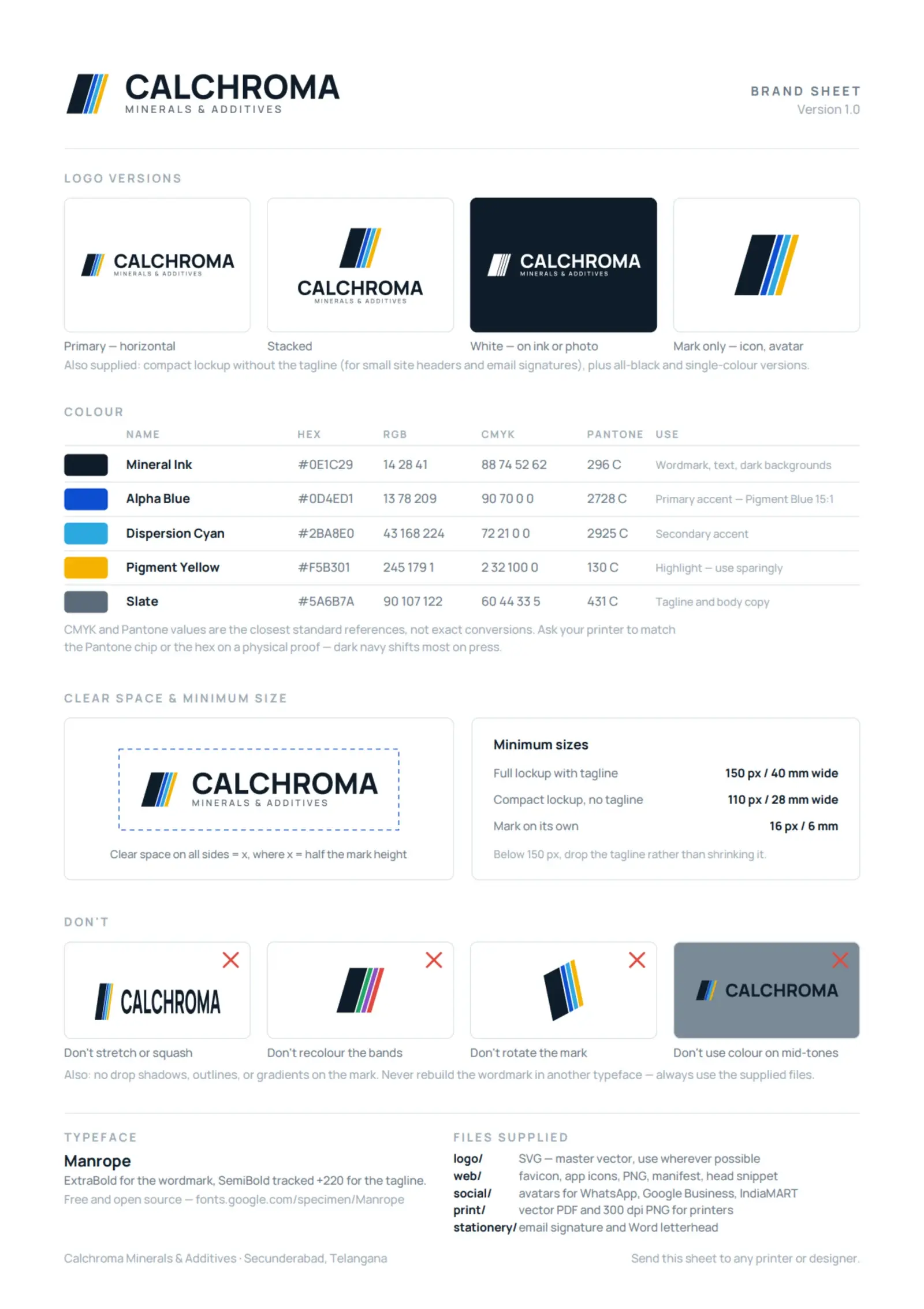
All of it, on one page
The brand sheet is the deliverable that stops the questions: logo versions, the colour table above with its CMYK column, clear space, the three minimum sizes and the four misuses that wreck it. Send it to a printer or a developer and stop explaining.
- Twenty master vectors — horizontal, stacked, compact and mark-only, each in five finishes
- A web pack: favicon set, app icons, OG image, manifest and a head snippet to paste in
- A print pack: vector PDFs and 300 dpi artwork, sized for stationery through to sack printing
- Avatars and covers laid out so nothing is lost when a platform crops to a circle
- Email signature and a Word letterhead the office can actually edit
- A README answering which file to use, in one line per case
Case studies using Branding & Identity
Questions
The ones people actually ask.
How many logo options do we get?
A small number of genuinely different directions rather than a page of variations on one idea, and each shown at the sizes it will really be used at, including small. Twenty options is a way of making the client do the deciding; the work is in narrowing them down before you ever see them.
How many rounds of changes do we get?
Three on the mark, and then it is locked. That is not a way of rushing you — it is because everything else is derived from that one drawing. Once the logo is signed off, the lockups, the finishes, the favicon set, the print artwork and the stationery are all built from it, so a change afterwards is not a tweak, it is remaking twenty files. Further rounds are quoted rather than absorbed, which is the honest version: unlimited revisions are priced into somebody's quote whether they tell you or not.
Do we get all of the packs?
You get the ones your brand actually needs, and they are quoted that way rather than bundled. A business that never prints anything should not be paying for 300 dpi artwork, and one selling in sacks needs print far more than it needs a LinkedIn cover. What does not vary is the master vectors, the rules and the brand sheet.
Who owns the logo?
You do, outright, including the master vectors. Everything lands in your own storage in formats that outlive us, and the typeface is free and open source, so nobody has to buy a licence to use your own brand.
We already have a logo. Is this still worth doing?
Often it is exactly the right job, and it costs less than a rebrand. If the mark works and the problem is that nobody can find the files or knows which version is current, what you need is the system around it rather than a new drawing.
Can our printer work from this?
That is what the brand sheet is for: one page carrying the logo versions, the colour values in CMYK and Pantone, the clear space and the minimum sizes. Send it and stop answering questions. And always send a printer the vector — never a PNG or a screenshot.
Will the colours look the same in print?
Close, not identical, and anyone promising identical has not printed much. Screens emit light and ink absorbs it, so the kit carries CMYK and Pantone references and says which colours shift most on press. Ask for a physical proof on anything that matters.
Do you do naming as well?
Not as a standing service. If you are naming something we will help pressure-test a shortlist — that it survives being said down a phone, that the domain exists, that it is not already somebody’s trademark — but the naming itself is usually better done by you, because you have to live with it.
Where this usually goes next
Next step
Send us the logo you have
Whatever state it is in — a JPEG, a screenshot, something from years ago, or nothing at all. That, plus where it has to appear, is enough to say whether this is a kit around what you already own or a mark drawn from the start.